

This month PowerApps has released the preview of the horizontal container and vertical container layout containers that further improves the experience of creating response PowerApps. PowerApps user community has been asking for responsiveness in PowerApps for quite sometime and this feature is now available
How to turn on this feature:
If you have an old app, where you want to have this feature turned on,
- Go to File > Advanced Settings
- Go to Layout Containers and turn it on.
If you are creating a new app, it is on by default.
Also, make sure Scale to fit is turned off
- Go to File > Screen Size + orientation
- Go to Scale to fit and set it off
- Click apply from the bottom right
How to make the PowerApp responsive using containers
In order to have a responsive app, you can start by inserting a responsive screen layout.
- Go to Insert > New Screen > Split-screen, Sidebar or Header, main section, footer
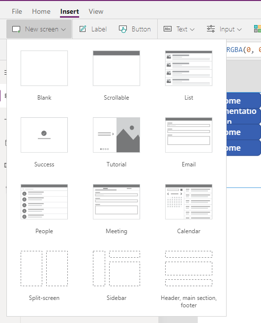
Selecting anyone of those will generate a screen with a standard layout with multiple containers.
You can also create a screen layout from blank; and then add containers within the screen keeping it in your required layout.
- From the left side of the screen, click on the insert (+) icon
- Search for containers, you will get three results: Horizontal Containers, Vertical Containers, and Containers.
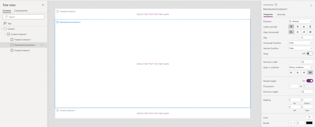
Properties of Container:
Containers help in placing objects encapsulated by the container responsively. There are different properties a container has, and when you add controls within a container, they have different properties compared to the button that is not within the containers.
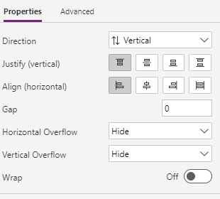
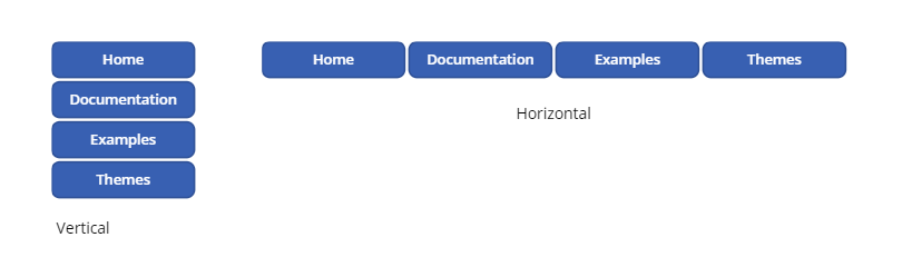
Direction: There are two options in the direction, Vertical and Horizontal. With vertical, you get the container’s controls one above another vertically, and with horizontal, you get the controls within the container to be placed in a horizontal sequence.
Justify (horizontal) & Align (vertical): Both of these give horizontally or vertically in the correct relative position. For example: left, right, center, and options like a stretch to fill the space in the container or Space between that distributes the controls equally within the container.
Gap: defines the space between two consecutive controls.
Horizontal Overflow and Vertical Overflow: This property hides or puts a scroll if there is an overflow of items within the control horizontally or vertically.
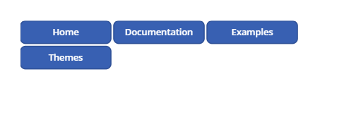
Wrap: it allows control to be wrapped onto the next line.
Responsive Properties of controls inside the container
Minimum height: If you have a horizontal container and your Align (vertical) is “Stretch”, you can define Minimum height. With the screen’s responsive behavior, the control might stretch and squeeze, but it can’t be less than the height defined with minimum height.
Minimum width: If you have a vertical container and your align (horizontal) is “Stretch”, you can define the minimum width. With the screen’s responsive behavior, the control might stretch and squeeze, but it can’t be less than the width defined with minimum width.
Align in the container: With this property, you can define the control’s alignment in the container; it can be “Set by container” or “custom”. If it is “Set by container” then it will inherit whatever is defined in the parent container. Still, in case you select custom, you can define an alignment unique to the selected control.
Flexible width: This property is available for the only horizontal container. With the flexible width off, the width of controls will be whatever width is defined in the properties. But when flexible width is On for a single control within a container, the button will occupy the space left within the container. If multiple controls have their flexible width set as On, both will occupy the space left equal portion control portion. You can define in the Fill portion property if a particular control needs to acquire a higher portion of the container’s space.
Flexible height: This property is available for only vertical containers. It is the same as flexible width but works vertically. With the flexible height off, the height of controls will be whatever height is defined in the properties. But when flexible width is On for a single control within a container, the button will occupy the space within the container. If multiple controls have their flexible width set as On, then both will occupy the space left in control in the equal portion. You can define in the Fill portion property if a particular control needs to acquire a higher portion of the container’s space.
Making the container responsive
With all the properties discussed above, the container’s controls will act responsive, but the container will still have a fixed width unless you define its width as “Parent.Width” . With this, the container will inherit the height of the screen it is in.
If you create a screen from New Screen and select the predefined responsive layouts, then the containers generated have all the property defined. Try creating a screen with a responsive layout. You can see three containers in a vertical container meaning that containers can be placed nested.
Similarly, If you look at their properties, you can find that the header container and the footer container have flexible height turned off, and the one in the middle has it turned on, making the container in the middle respond according to change in screen size.
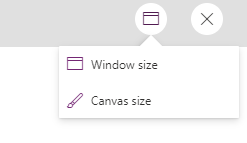
Change app size in preview
When you preview the app, you can find an icon in the top right. If you click the icon, you get option to choose between Window Size and Canvas Size. When you select Window Size, the app will respond to the changes when you change the window’s size. When you select Canvas size, it stays pretty much static.
Custom logic based on device being used
One of the amazing properties that you can use to define cases for different devices is the Size property. The screen’s Size property classifies the current device size. If you want to hide certain elements or change the logic for width height base of the screen size, you can use Parent.Size and compare with ScreenSize.Small, ScreenSize.Medium etc.
| Constant | Value | Typical device type (using default app settings) |
|---|---|---|
| ScreenSize.Small | 1 | Phone |
| ScreenSize.Medium | 2 | Tablet, held vertically |
| ScreenSize.Large | 3 | Tablet, held horizontally |
| ScreenSize.ExtraLarge | 4 | Desktop computer |
In conclusion, PowerPlatform has opened doors to limitless possibilities with the release of this feature. Responsive Powerapps is going to solve lots of problems that we had to convince clients as a platform restriction.
You can find official Microsoft documentation here:


