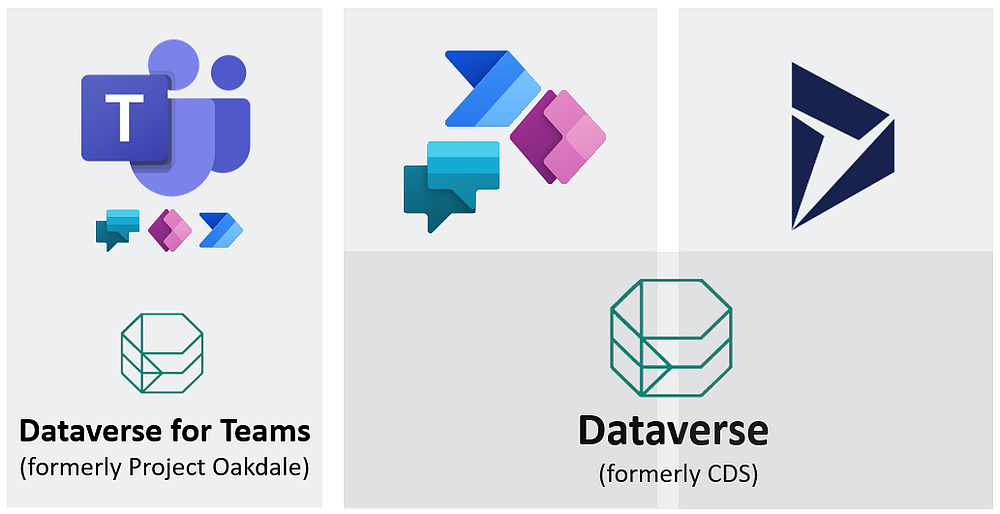
Microsoft has finally renamed “Common Data Service” to “Microsoft Dataverse” and “Project Oakdale” to “Microsoft Dataverse for Teams” after briefly calling them Dataflex and Dataflex pro. In this article, we will discuss what Microsoft Dataverse for the Team is, how it differs from Dataverse, and many possibilities it drives.
Microsoft Dataverse is a data storage platform that acts as the foundation for PowerPlatform. Microsoft Dataverse for Teams is a subset of Dataverse that inherits much of its features. Microsoft added these low-code/no-code components within Teams to position it as a platform for all work forms, not just limiting it as a communication app.
Previously, Microsoft Teams could use Microsoft Team Toolkit for Visual Studio and VS Code to build teams app. While you can continue to do that, you can leverage the power of PowerPlatform to develop quickly.
Following are the differences between a Dataverse for Teams and Dataverse table features.
Feature
Dataverse for Teams
Dataverse
Basic data types
Yes
Yes
Advanced data types (customer, multiple transaction currencies)
No
Yes
Common Data Model
Coming Soon
Yes
Relational storage
Yes
Yes
Non-relational storage (logs)
No
Yes
Managed data lake
No
Yes
File and image support
Yes
Yes
Find, filter, sort
Yes
Yes
Advanced and relevance search
No
Yes
Mobile offline
No
Yes
So, what can you do with Microsoft Dataverse for the Team?
With Microsoft Dataverse Teams, you can now use almost all the features of PowerApps, PowerAutomate, Virtual agent, and PowerBi. That means you can create, run, share app, bots, and flows inside the Teams.
You will also get a storage capacity of 2GB per Team with 1 million records. With Dataverse in Team, you get the ability to build, populate, and query data. You can create multiple tables, add fields to them, and define the relationship of tables with each other. You can upgrade Dataverse for Teams to Dataverse if the company needs additional features, such as more granular protection and governance control or capability above approximately 1 million.
It also comes with security that’s easy to use and aligned with approaches used in Teams with a focus on Owners, Members, and Guests.
Each Team has it’s Dataverse environment. If you create tables in the Teams and go to the admin center to check, you can figure multiple Environments listed with Environment type as Microsoft Teams.
Limitation with Teams
With Dataverse for Teams, there is a limit in storage capacity, 1 million rows or 2 GB.
You have a limit of creating 500 Teams with a Dataverse environment.
You can’t share Power Apps outside the Team it is built.
You can share Power Virtual Agents with an entire organization, but the system will also remove the app/flow/bot if you remove the Team.
You can’t use “Premium connectors” unless you have a license to use it. And these licenses can be too expensive.
This month PowerApps has released the preview of the horizontal container and vertical container layout containers that further improves the experience of creating response PowerApps. PowerApps user community has been asking for responsiveness in PowerApps for quite sometime and this feature is now available
How to turn on this feature:
If you have an old app, where you want to have this feature turned on,
Go to File > Advanced Settings
Go to Layout Containers and turn it on.
If you are creating a new app, it is on by default.
Also, make sure Scale to fit is turned off
Go to File > Screen Size + orientation
Go to Scale to fit and set it off
Click apply from the bottom right
How to make the PowerApp responsive using containers
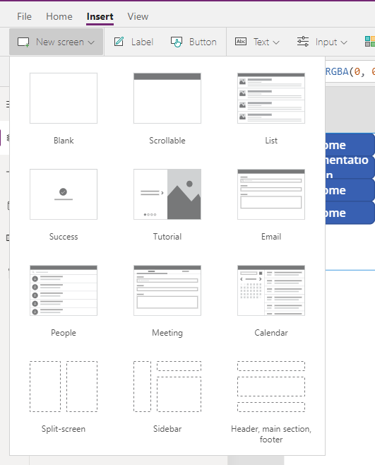
In order to have a responsive app, you can start by inserting a responsive screen layout.
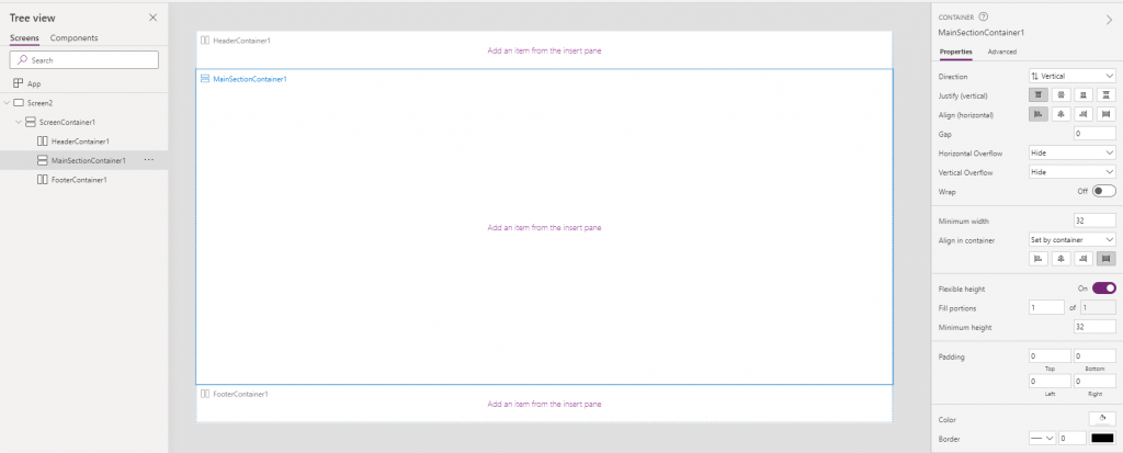
Go to Insert > New Screen > Split-screen, Sidebar or Header, main section, footer
Selecting anyone of those will generate a screen with a standard layout with multiple containers.
You can also create a screen layout from blank; and then add containers within the screen keeping it in your required layout.
From the left side of the screen, click on the insert (+) icon
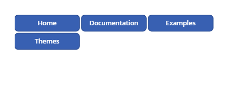
Search for containers, you will get three results: Horizontal Containers, Vertical Containers, and Containers.
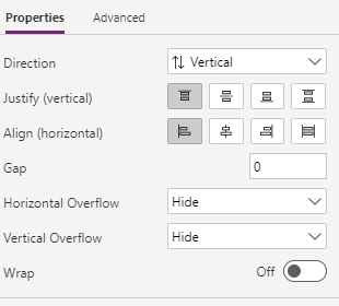
Properties of Container:
Containers help in placing objects encapsulated by the container responsively. There are different properties a container has, and when you add controls within a container, they have different properties compared to the button that is not within the containers.
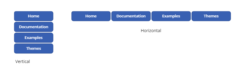
Direction: There are two options in the direction, Vertical and Horizontal. With vertical, you get the container’s controls one above another vertically, and with horizontal, you get the controls within the container to be placed in a horizontal sequence.
Justify (horizontal) & Align (vertical): Both of these give horizontally or vertically in the correct relative position. For example: left, right, center, and options like a stretch to fill the space in the container or Space between that distributes the controls equally within the container.
Gap: defines the space between two consecutive controls.
Horizontal Overflow and Vertical Overflow: This property hides or puts a scroll if there is an overflow of items within the control horizontally or vertically.
Wrap: it allows control to be wrapped onto the next line.
Responsive Properties of controls inside the container
Minimum height: If you have a horizontal container and your Align (vertical) is “Stretch”, you can define Minimum height. With the screen’s responsive behavior, the control might stretch and squeeze, but it can’t be less than the height defined with minimum height.
Minimum width: If you have a vertical container and your align (horizontal) is “Stretch”, you can define the minimum width. With the screen’s responsive behavior, the control might stretch and squeeze, but it can’t be less than the width defined with minimum width.
Align in the container: With this property, you can define the control’s alignment in the container; it can be “Set by container” or “custom”. If it is “Set by container” then it will inherit whatever is defined in the parent container. Still, in case you select custom, you can define an alignment unique to the selected control.
Flexible width: This property is available for the only horizontal container. With the flexible width off, the width of controls will be whatever width is defined in the properties. But when flexible width is On for a single control within a container, the button will occupy the space left within the container. If multiple controls have their flexible width set as On, both will occupy the space left equal portion control portion. You can define in the Fill portion property if a particular control needs to acquire a higher portion of the container’s space.
Flexible height: This property is available for only vertical containers. It is the same as flexible width but works vertically. With the flexible height off, the height of controls will be whatever height is defined in the properties. But when flexible width is On for a single control within a container, the button will occupy the space within the container. If multiple controls have their flexible width set as On, then both will occupy the space left in control in the equal portion. You can define in the Fill portion property if a particular control needs to acquire a higher portion of the container’s space.
Making the container responsive
With all the properties discussed above, the container’s controls will act responsive, but the container will still have a fixed width unless you define its width as “Parent.Width” . With this, the container will inherit the height of the screen it is in.
If you create a screen from New Screen and select the predefined responsive layouts, then the containers generated have all the property defined. Try creating a screen with a responsive layout. You can see three containers in a vertical container meaning that containers can be placed nested.
Similarly, If you look at their properties, you can find that the header container and the footer container have flexible height turned off, and the one in the middle has it turned on, making the container in the middle respond according to change in screen size.
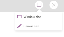
Change app size in preview
When you preview the app, you can find an icon in the top right. If you click the icon, you get option to choose between Window Size and Canvas Size. When you select Window Size, the app will respond to the changes when you change the window’s size. When you select Canvas size, it stays pretty much static.
Custom logic based on device being used
One of the amazing properties that you can use to define cases for different devices is the Size property. The screen’s Size property classifies the current device size. If you want to hide certain elements or change the logic for width height base of the screen size, you can use Parent.Size and compare with ScreenSize.Small, ScreenSize.Medium etc.
Constant
Value
Typical device type (using default app settings)
ScreenSize.Small
1
Phone
ScreenSize.Medium
2
Tablet, held vertically
ScreenSize.Large
3
Tablet, held horizontally
ScreenSize.ExtraLarge
4
Desktop computer
In conclusion, PowerPlatform has opened doors to limitless possibilities with the release of this feature. Responsive Powerapps is going to solve lots of problems that we had to convince clients as a platform restriction.
You can find official Microsoft documentation here:
Just In Microsoft has released the Powerapps new search experience in Model-Driven Apps. In this article, I am going to discuss how to enable this feature, what features it gives, what are the improvements over the previous relevance search, and some of the things you might need to be aware of.
Turning on PowerApps new search experience
To turn on the new search feature, you can follow steps:
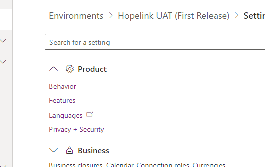
Click on the gear icon on the right side of the screen.
Click on the admin center from the menu.
Select the environment for which you want this feature to be turned on.
Click on setting from the top ribbon
Click on Product, then click on Features
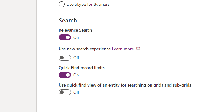
Turn on the Use new search experience
After setting the User new search experience on, if that doesn’t work
Turn off the relevance search feature
Wait for 5-10 min
Turn it back on
What’s new in the search experience
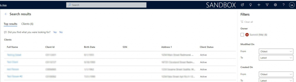
The new search experience has a nice user experience for searching records. There are a number of improvements in the new experience:
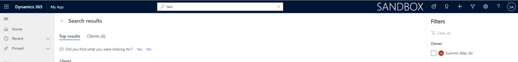
Search from the header:
The search used to be on the right side of the top bar which was a lot less prominent was difficult to figure out. The new experience is much more prominent and is easily discoverable on all pages.
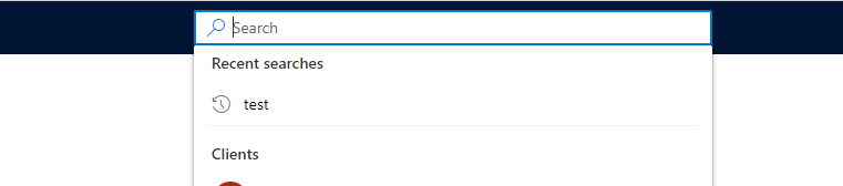
Recent searches and recently access searches:
This gives a more personal experience of recently searched records and recently accessed searches.
Search-as-you-type:
This feature is another way the new search feature helps you find information without you needing to figure out a whole query.
Improved search result page:
On this page, there are search results for the query grouped by the table with a sort of record grid. You can also apply additional filters to search.
Intelligent Search:
Microsoft documentation says PowerApps new search experience leverages AI for natural language processing and fixes issues that come from incorrect spellings to deliver better results. But the results that you may find in the quick search might not appear when you click show all results. The quick suggestion search and search page are different by design and there is no way around for this so at least for something it will stay like this.
Issues you may face
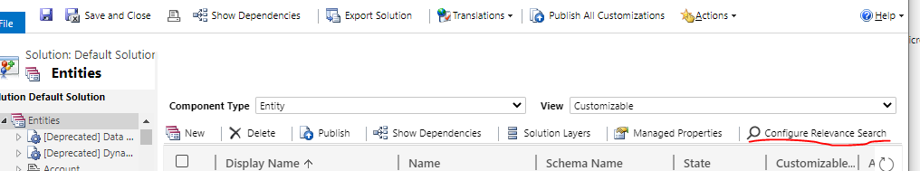
The search may not search all your entities. You have to configure your entity in the relevant search list. Click on Gear Icon, click on Advanced Settings > Settings > Customizations > Customize The System. You’ll get a Default solution window. Click on Entities and configure the relevance search. And publish all.
The search might not search through the right field. Again from the legacy Solution Explorer, Go to Quick Find View for the entity, select Add Find Columns, and check the boxes for the fields you want to be considered for the search.
The search might not show all the records, in that case, go to the filter criteria for the Quick Find view of your entity. Usually, you might not see the inactive records due to filter criteria being placed in this view.
In this article, I am going to point out a few of the changes in the PowerPlatform that happening since Nov 2020. So, we have got updates in CDS terminologies and PowerPlatform URLs. As Microsoft is putting all its effort in turning PowerPlatform as one of its flagship, we have seen many upgrades coming in last few years in an accelerated rate.
Check out the new PowerPlatform icons in articles below:
Common Data Service has for database management across PowerPlatform. Thus it enables you securely store and manage data that are used by business applications. When you use Standard and custom entities within Common Data Service, it provides a secure and cloud-based storage option for your data.
While that still continues to work, Microsoft has changed some of the core-terminologies that we have been using since the days of Dynamics 365. Microsoft has been overenthusiastic with regards to PowerPlatform, however, these changes are based on the feedback from users and it is intended to make the Platform more intuitive. So, this gives an end to using terms like Entities, Optionsets, Columns, PowerPlatform after being around for a long time.
Old Terms
Updated term
Entity, entities
Table, tables
Field, fields Attribute, attributes
Column, columns
Record, records
Row, rows
Option set, multi select option sets Picklist, picklists
Choice, choices
Two Options
Yes/No
Table 1: Terminology updates in Common Data Service
So, these are already started to reflect across the platform in all areas where previous terms were used, as seen below:
I’m not a great fan of Microsoft changing terminologies, but I feel like these terms can help us connect with techies that works in other platform. In the general, Developers across other platforms use terms like tables, rows. columns more often that entity, fields so it can help in the transition for people across other platforms.
Change in PowerPlatform URLs
Also, Simon Mathews on PowerApps blog has made an announcement regarding the changes in the URLs in the PowerPlatform. For the moment, it will support redirection from the current path but eventually will depreciate.
In conclusion, Microsoft has been renaming products and terminologies like flow turning into PowerAutomate but at the end of the day, they are definately heading towards providing a great ways to build application.
At Ignite 2020, Microsoft showed us the new Power Platform Icons for the very first time. I had a tough time searching it on google so please find all the in this blog. Find PowerApps logo 2020, PowerAutomate Logo 2020, PowerBi logo 2020, and Power Virtual Agent Logo 2020. All the icon set of PowerPlatform.
The Bulk Edit feature is an underdog feature in Model-Driven App. The fat that when you do the bulk edit it opens the form in the old bulk edit form design speaks the fact that it’s not much of the priority at the moment.
However, Customers love to bulk edit, specially because Companies that have adapted the bulk edit feature are usually big enterprises with thousands if not million of data. So, filtering and bulk editing is quite common work that happens.
While working on the bulk edit, it can give you errors if not done correctly.
The privilege issue:
To bulk edit you need two privileges, write on the entity in question and bulk edit. The edit option won’t appear when you multi-select records in Model-Driven PowerApps if these privileges are not given.
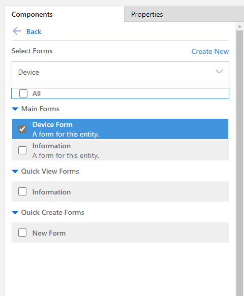
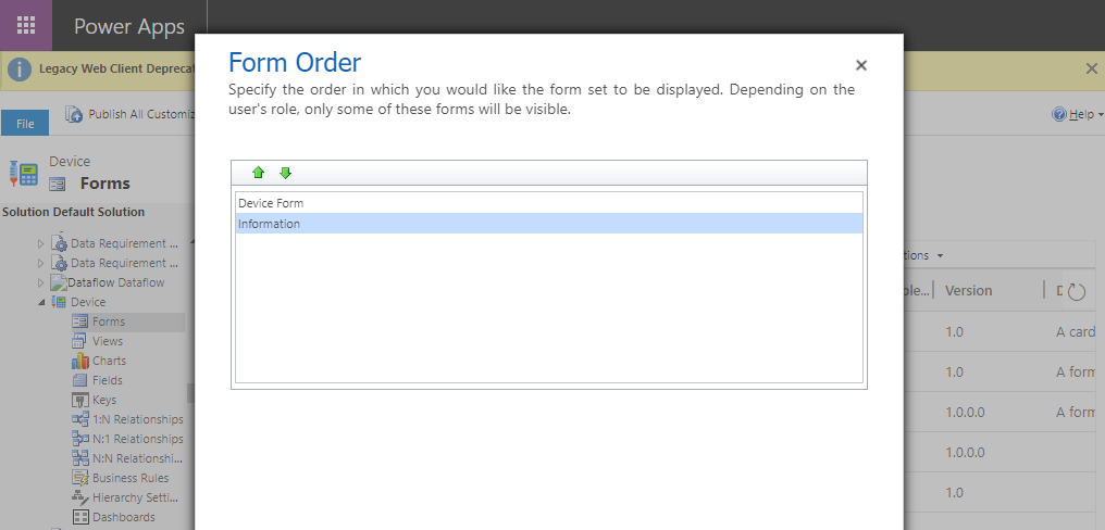
The first main form in the form order
The bulk edit form uses the first form in the form order. Though it’s something one would expect more control over because if have multiple forms, you may not have the form that you want to be used to bulk edit.
In the app designers of the Model Driven app where you want to edit, you must have the Main form checked.
In my case, I want Device Form to appear in while doing the bulk edit to appear as the default form. So, I kept it first in the form order and checked it in the App designer.
Not doing so, you will get a dialogue box that says Invalid Argument.
PowerApps performance optimization has become one of the important aspects of the platform as it continues to evolve and many organizations are adopting it. The convenience that PowerApps has afforded customers to interact with businesses via apps – and vice versa, of course – paves the way for necessitating better, efficient app performance. In this article, I’m here to help provide tips on ways to improve your PowerApps performance. Here’s the list of 40 things to make sure of the performance of the app.
Try to limit the number of controls on the screen. The time taken to render the page in PowerApps screen has a direct relation with the number of controls on the screen. There is not a defined limit but at around 300-400 controls, there have been experiences of slow loading times.
Use Components rather whenever you need to reuse certain blocks like header or footer. Components also reduce duplication of efforts by eliminating the need to copy/paste controls and improve performance.
Have the right data source for the task you’re looking to process through your low-code app.
Loading Data on App Start, On Visible, and within individual controls like the gallery control.
User Pre-loader animation to sets user expectations while data is loading.
Fetch data in such a way that the required data are loaded at first and while user interaction is happening call the remaining data in the background.
Use Concurrent Call in cases when you don’t have to do serial calls. Concurrent function evaluates multiple formulas at the same time
User Monitor tool to find events and logs that could help diagnose performance and functional issues.
Use compressed images to minimize the time to download them.
Update view of the data in such a way that users see data updates reflected in the user interface while actual save (Patch/Submit) is done in the background.
Avoid passing context variables between screens when a global variable is more appropriate.
If you have multiple formulas or rules that reference the value of a Text input control, set the DelayOutput property of that control to true.
Use inline expressions in control properties instead of putting logic in the OnVisible event in your PowerApp’s first screen.
Limit your use of collections, try to use them only when absolutely necessary.
Limit your use of context variables, try to use them only when absolutely necessary.
Use ClearCollect instead of Clear;Collect().
Use CountIf instead of Count(Filter()).
Update all necessary context variables in a single UpdateContext call
Avoid using unnecessary DataCards or Canvases if they have nested galleries, which will not work in the future.
Don’t use multiple variables when you could just use a single one.
Don’t ‘nest’ secondary logical tests by explicitly writing If after the initial statement.
User one control’s styling properties like color, fill, x, y, width, height properties as the master to style other controls.
Use galleries whenever there is repetitive data instead of using multiple repeated controls to show as if it is a grid.
Use a single screen to handle edit/insert operations.
Use a CardGallery to handle updating data instead of referencing individual controls in a Patch function.
When working with an Excel sheet as a data source, use one DataTable per worksheet.
Don’t connect to more than 30 data sources from the same app.
Use the ClearCollect function to cache data locally if it doesn’t change during the user session.
Use the Set function to cache data from lookup tables locally to avoid repeatedly retrieving data from the source.
Use functions that delegate data processing to the data source instead of retrieving data to the local device for processing.
Republish your apps to get performance improvements and additional features from the Power Apps platform.
Avoid repeating the same formulas in multiple places
Don’t use Set to create a context variable, which holds a piece of information scoped to single-screen use UpdateContext instead.
Use IsError for exception handling wherever possible
Handle SubmitForm failure or success using onFailure or onSuccess.
Ensure no delegation warnings from the app checker.
where you can try a new formula bar experience with improved speed and usability features informed by some of the requested improvements from the community.
Use HTML control to display images or displaying images to lessen the load on the Media
If you are using custom APIs in your apps, you should enable server-side caching as you would do normally three tier applications.
There is no direct trigger in PowerAutomate that triggers when a folder is created. You can achieve this with when an item is created trigger.
A trigger is the thing (event) that happens that starts the process. That’s what you’re asking the workflow to look out for. For example, when someone loads a file in a specific location.
Actions are the things you want the workflow to do once the trigger takes place. For example: Send boss email to approve new document.
You can create a PowerAutomate and have “When an item is created” as the trigger. The next you need to do is add a condition to check whether the item that was created is a folder or not.
You can put a condition and add “isFolder” equals to true in the condition. Rest of the actions you can keep inside the Yes of the condition.
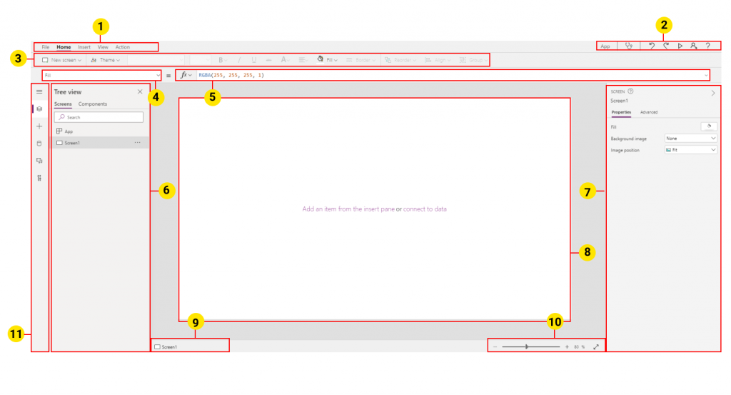
In this article, you will learn about different areas within a power apps screen. The PowerApps studio helps in building and using custom business apps that connect to your data and work across the web and mobile – without the time and expense of custom software development. You can use Power Apps Studio to design, build, and manage your canvas app. To excel in PowerApps Development, you need to know the different components of a PowerApps Studio Screen.
The main tab has three tabs; File, Home, Insert, View, and Action.
File tab will take you to a system menu screen where you can save your app, share the app, or view collections, media, and variables used in the app.
The home tab is where you can add new screens to your app, format, re-order, align, or group objects together.
Insert tab is where you can add objects (buttons, galleries, labels, forms, pictures, icons, etc…) to your app.
View tab helps to see the current data sources in your app or create new data sources. It helps you to see collections, media, and variables used in the app and open up advanced settings for selected objects.
Action tab helps you to quickly add actions to the OnSelect property of selected objects.
App actions are the action that helps to preview the app, run the app checker, redo, or undo the action, share the app with other users, and help icon.
In this Ribbon, you get options based on what you’ve clicked in the Main tab where. If you have selected Insert in the main tab, you add controls and customize design elements
Property drop-down list gives you the properties of the object you have selected, if no objected is selected, the current screen property is shown. You can define the properties or formula in the formula bar for the currently selected object.
The formula bar is the section where you define or edit a formula for the property of the selected object.
The left pane gives you different options based on what you select from the focus zone option. You can see the app in a tree view, see a list of data sources, media galleries, and advanced tools.
Properties pane shows the UI properties for the selected object and Advance properties in another tab.
Canvas/screen is the main area where you put objects for composing the app structure.
App breadcrumb container gives a trail of objects that contains each other on the screen.
Change canvas screen size zooms in or zooms out the size of the canvas during development in Power Apps Studio.
The Focus zone helps you switch between a list of options like tree view, inserting controls, data sources, and advancedd tools.
PowerApps gives you loads of built-in controls and ways to visualize your data with just a few clicks. Often, however, with just those controls, you may want to create custom visualizations that are not quite achievable. This article illustrates the way you can create custom visualizations of your own. In such situations, it can help to save your day by using SVG in Powerapps.
What are SVGs?
SVG stands for Vector Graphics Scalable. It is a vector image format based on the Extensible Markup Language (XML) for two-dimensional graphics with interactivity and animation support.
Implementing SVG in PowerApps
In order to use SVG in PowerApps, you can take following steps:
Insert an Image control into the PowerApps Canvas.
In the Image property of the Image control, add a string on the front showing the image data form “data:image/svg+xml;utf8, ” and followed EncodeUrl encapsulating the SVG code. The code becomes:
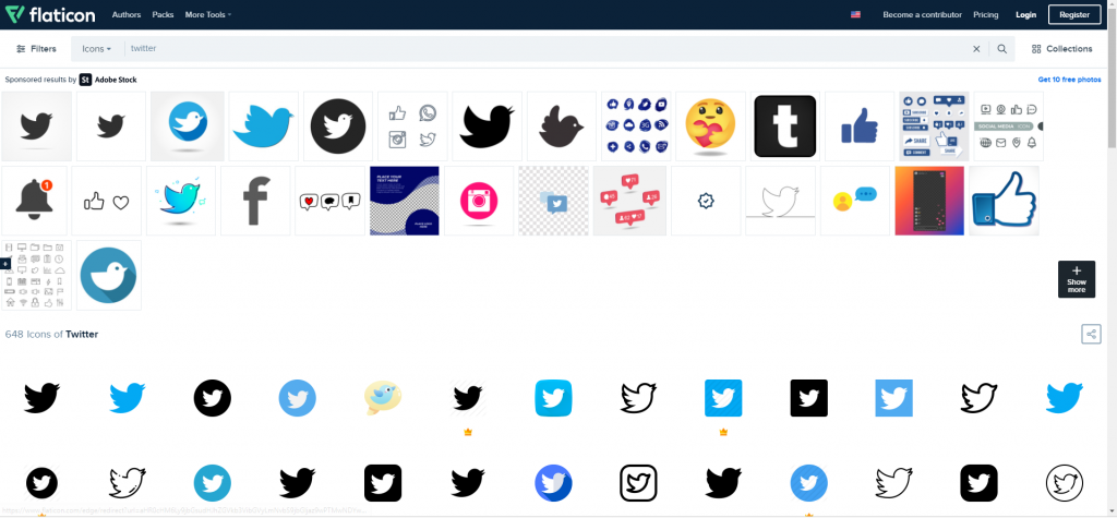
SVG is can be used to place complicated icons in your application. To get SVG images, you can navigate online to find SVG images. In this blog, I am placing a twitter SVG icon in the PowerApps. You can download the icon from here: https://www.flaticon.com/
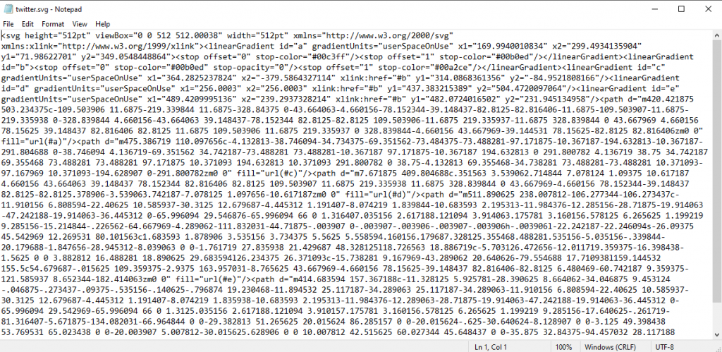
I’ve download the SVG file of the twitter icon from the list:
I can see when I open the SVG in a text editor that I have <svg at top and bottom sections and different code in between the,.
Since, the SVG we’ve got has double quotes, it can’t be placed directly in the PowerApps. So, I’ll use an online tool to convert the double quotes to single quote. You can find it over here:
Once, converted I copy the code from and place it in our PowerApp. And for that, I insert an image in the code, Paste the code in the code and put the string in front defining format of image data.
And voila, here we have our twitter icon in our PowerApps.
In conclusion, this was a quick overview of using SVG in PowerApps, in the next blog, we’ll further discuss over changing color, animating or Dynamic changes that we can apply in the SVG in PowerApps.


 on the right side of the screen.
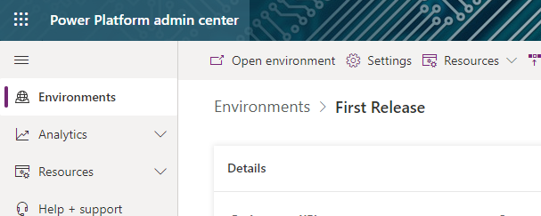


